student manual to master supply and demand curves for competitive market analysis Mastering Supply and Demand Curves: Student Manual to Competitive Market Analysis economics hw help for demand and supply curves Master supply and demand curves with expert economics graph help. Learn to analyze competitive markets, avoid pitfalls, and ace your economics hw.
If you have ever wondered how the price of avocado toast skyrocketed overnight or why concert tickets sell out in seconds, supply and demand curves hold the answers. These deceptively simple graphs are the backbone of microeconomics, acting as a visual language to decode market behavior. But here is the catch: interpreting them isn’t just about drawing two lines. It’s about understanding the stories those lines tell—stories of scarcity, consumer psychology, and market power. Whether you are staring at an assignment or prepping for an exam, this guide will transform how you analyze these curves, with practical examples and a sprinkle of macroeconomics graph help to cut through the noise.
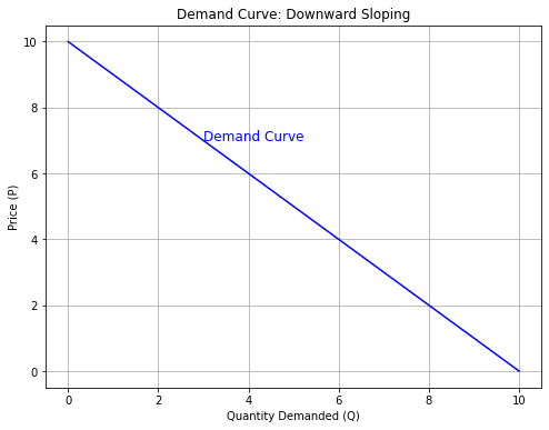
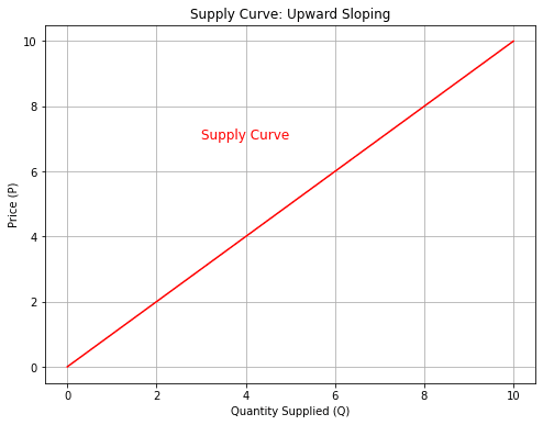
Before diving into analysis, let’s clarify what these curves aren’t. They are not arbitrary squiggles; they are mathematical relationships with real-world implications.
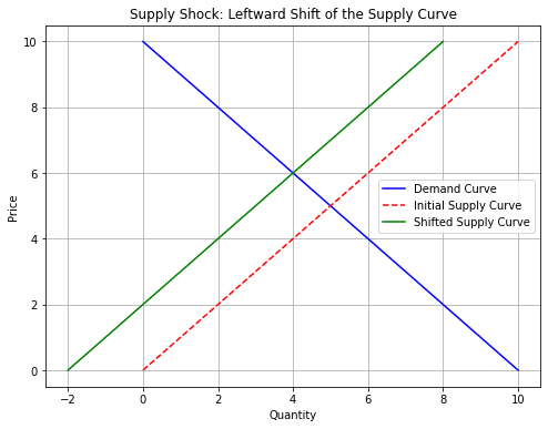
Let’s tackle a real-world scenario: What happens to the coffee market if Brazil’s harvest fails?
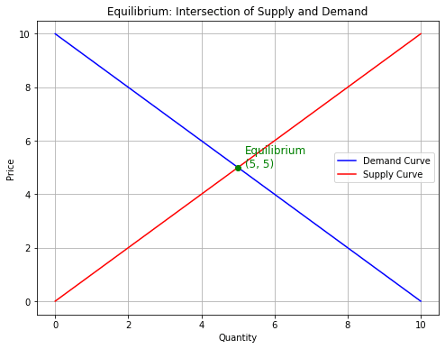
Draw equilibrium where supply (S) and demand (D) intersect. Label the initial price (P1) and quantity (Q1).
Brazil’s drought reduces global coffee bean supply. This is a supply shock—shift the supply curve left (S → S1).
Imagine the market for electric vehicles (EVs). If lithium prices drop (reducing battery costs), the supply curve shifts right. But if governments end EV subsidies simultaneously, demand could shift left. The final equilibrium depends on which shift dominates—a classic “tug of war” analysis.
Even advanced students stumble here. Let’s fix three recurring mistakes:
Ready to level up? Try these twists:
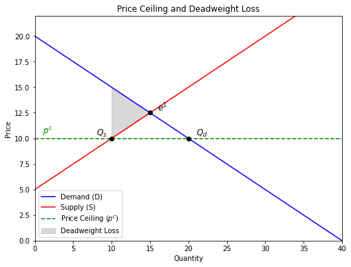
Example: Rent control. A ceiling below equilibrium creates shortages (more renters chasing fewer apartments) and black markets. Graphically, this looks like a triangle of lost value between S and D.
A carbon tax shifts the supply curve left, aligning private costs with social costs. The graph visually captures the true cost of pollution.
If the U.S. imports sneakers, the domestic supply curve becomes perfectly elastic at the world price. Tariffs? That’s a vertical shift upward.
Bottom Line: Supply and demand curves aren’t just classroom exercises-they are lenses to view the world. Master them, and you will start seeing hidden connections everywhere, from grocery stores to crypto markets. And remember, even experts need economics graph help sometimes. The key is to keep asking, What story is this graph telling?
